One week ago, Barclays
announced
the suspension of issuance of new creation units as well as sales from
inventory for two of its ETNs: the iPath Series B S&P 500 VIX Short-Term
Futures ETN (VXX);
and the iPath Pure Beta Crude Oil ETN (OIL).
The purpose of
this post is to explain the risks for both long and short holders of VXX and to
get a sense of how this story is likely to play out.
First of all,
the announcement came before regular trading hours on March 14th and
during the entire session, VXX traded at a premium of up to 3.28 points relative
to its intraday
indicative value (IV), as captured in a graphic in Barclays
Suspends Creation Units for VXX. By
the end of the day, VXX was trading at a 1.73 point premium to indicative value -- which is what VXX would be trading at if new creation units were still enabled.
It wasn’t until
March 15th that the fireworks begin.
That morning, VXX opened up another 2.08 points at 30.89, up 6.7% from the
previous day’s close. Right from the
open there was some intense buying pressure that resulted in a short squeeze, with VXX briefly spiking as high as 41.65, up 44.6% from the previous day’s
close. That short squeeze was retraced
over the course of the day and by the end of the session, VXX was down 0.11 on
the day. The action during the last five
days has been relatively uneventful, though the volume in VXX has dropped
approximately 90% from a pre-suspension average of about 50 million shares per day
to less than 5 million today. As of
today’s close, VXX was at 25.44, some 3.93 points (15.4%) over indicative
value.
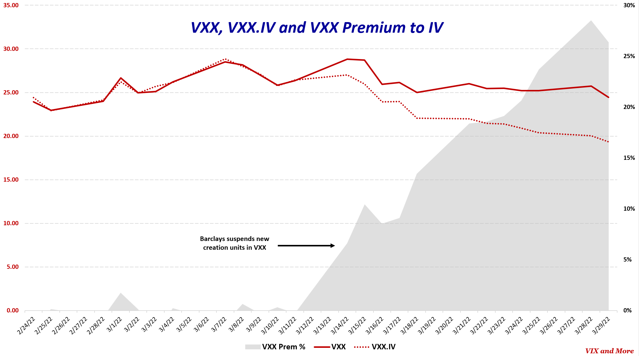
The chart below
captures the journey of VXX relative to indicative value (VXX.IV) in the seven
days going back to the original announcement of the suspension of new creation
units. Note that for the last week, the
VXX premium relative to VXX.IV has been in a range between 1.50 and 5.00, with
that early short squeeze premium of 15.11 now firmly in the rear-view
mirror. At various times it appeared
that traders had settled on 3.50 or 4.00 as an appropriate amount of premium
for VXX in the absence of new creation units that could be used to arbitrage
the price of VXX back down to VXX.IV.
The big questions
are what to expect going forward and what are the risks to both long and short
holders of VXX. At the risk of stating
the obvious, nobody outside of Barclays knows what will happen going forward,
but Barclays described their move as a temporary suspension of creation units. With VXX having assets of $729 million and a fee of 0.89%
per year, Barclays has an incentive to find a solution for the creation units
problem – and whatever is behind it – so that they can collect their $6.5
million annual fee from this product.
Credit Suisse was able to resolve a similar problem with the suspension TVIX
new creation units in a month and a day back in 2012. Barclays and VXX have been at this game
longer than anyone else, with an initial launch of VXX back on January 30, 2009. They have had 13 years to prepare for the present
situation, which is likely a least partly related to hedging risks and costs
associated with how Vladimir Putin proceeds with the invasion of Ukraine. I expect they will find a solution to the new
creation units problem in relatively short order, but I have no insight into
whether this will be a matter of days or weeks.
Going forward, both
longs and shorts have to expect that Barclays will bring VXX creation units
back and when they do, the VXX premium relative to VXX.IV is likely to
disappear almost instantly. Truth be
told, when Credit Suisse brought back creation units in TVIX back in 2012, it
took two days for most of the indicative value premium to be wiped out, but those
days were excruciating losses of 29.3% and 29.8% that left investors reeling
and confused. This time around the
premium at risk of another new creation units air pocket is “only” 15.4% -- but
there is very little to prevent this number from growing much larger.
This brings us
to the other side of the equation. How
much higher can a short squeeze take VXX?
While 90% of the daily volume in VXX has evaporated in the past seven
days, the current 5 million shares per day will likely have to shrink
considerably more before a short squeeze has much in the way of potential
staying power. The DGAZ story from 2020
is a stark reminder that not only is it theoretically possible to see a spike
of 12,000%, but such a spike has recently happened. The problem for longs is that in waiting for
a potential short squeeze, each day brings them one day closer
to the seemingly inevitable announcement of a restoration of creation units and a 15.4%
contraction in the price of VXX. In
addition to that potential 15.4% haircut, long holders should also keep in mind
that VXX has lost an average of 56% per year going back to 2009 due to
structural weaknesses such as contango,
negative roll
yield and daily compounding decay (which I have summarized in posts such as
Four
Key Drivers of the Price of TVIX), so time is not on the side of VXX longs.
In summary, the
risk for shorts is the potential for a successful short squeeze along the lines
of the DGAZ fiasco. As volume in VXX
decreases, which is likely to be the case until Barclays resolves the new creation
units issue, the risk of a short squeeze rises.
On the other hand, the risk for longs is the resumption of new creation
units almost immediately wiping out the premium over indicative value. Both longs and shorts are likely to see their
risks go up over time. For VXX short,
the assumption is that volume will continue to go down over time, increasing
the risk of a short squeeze. For VXX
longs, the risk is that a solution to the creation units problem is just
around the corner and could be announced at any time. An announcement is unlikely to come out
during the trading day, but overnight risk should be treated as considerably
higher than intraday risk.
This situation is exactly the type of “jump risk”
(or gap risk) that makes options an attractive way to structure a trade – either
on the long or short side. That said,
note that implied volatility in VXX options is presently at an elevated level
of 102, making outright purchases of VXX puts and calls expensive in
the current environment.
I should note
that VXX long holders may also be subject to acceleration risk, which means
that this product is subject to early redemption or an “accelerated” maturity
date, at which point the ETN would be redeemed at indicative value (VXX.IV)
not at the current market price. For
more information on the risks associated with ETNs, FINRA has a good
summary of the issues.
Last but not
least, I should mention that the OIL ETN that had
its creation units halted at the same time as VXX has seen very little in the
way of premium over indicative value, with the biggest exception being a
smaller squeeze/spike on the second day that coincided with the big spike in
VXX. Right now, the premium in OIL is a
mere 0.03. This does not mean that the
Reddit wallstreetbets
crowd will not suddenly pile into the OIL trade in an effort to squeeze the
shorts in a lower volume name, but so far at least, the WSB crowd does not see
OIL in the same way they saw the VXX
or Opportunity of a Lifetime trade.
So, whether you
are long or short VXX, understand the risks associated with your position and
the time and volume factors also at work.
For those who insist on trading this name, consider structuring
positions as defined-risk options trades.
In the graphic
below, I show the premium of VXX to VXX.IV over the course of the last seven
days, using 30-minute bars.
[source(s): Yahoo, TD Ameritrade, VIX and More]
Further Reading:
Barclays Suspends Creation Units for VXX
Attempt at TVIX Short Squeeze Fizzling Out
The Resurrection of TVIX
TVIX Premium to Indicative Value Creeping Back Up
TVIX Creation Units Return; What It Means for Investors
Is TVIX Now Just a More Docile UVXY?
Recent TVIX Volume and VIX Futures Volume
The Story of VIX ETPs Relative to their Intraday Indicative Values
The Ups and Downs of the New Premium in TVIX
Credit Suisse Suspends Creation Units in TVIX: What it Means
Four Key Drivers of the Price of TVIX
Will TVIX Go to Zero?
TVIX Topples VXX as Highest Volume VIX ETP
Who Is Trading TVIX?
Volatility Becomes Unhinged on Friday
TVIX Finally Getting Its Due As Day Trading Rocket Fuel
TVIX Trades One Million Shares for First Time
All About UVXY
While it has not been updated in a while, new readers may also enjoy older posts that have been tagged with the Hall of Fame label.
For those who may be interested, you can always follow me on Twitter at @VIXandMore
Disclosure(s): net short VXX at time of writing